Data Humanization
Graphic Design
Project Overview
In this project, my goal was to visualize invisible emotions and everyday environmental dynamics at Koç University—helping us reflect on how we feel, were we are, and what surrounds us. The intention is not just to inform, but to create aesthetic empathy, a sense of connection through visualization.
Through both parts of this project, I aim to shift our relationship with data—from seeing it as a tool of surveillance or optimization, to embracing it as a mirror of human experience. My visualizations ask not “What is the data?” but “How does it feel?” and “What story does it tell us about our lives, our spaces, and our shared concerns?”
What is Data Humanization?
Data humanization is the practice of transforming abstract, impersonal numbers into representations that reflect the complexity and emotion of real human lives. It’s not just about presenting data—but about embedding it in personal context, making it relatable, expressive, and emotionally resonant.
Inspired by pioneers like Stefanie Posavec and Giorgia Lupi, who emphasize data as a form of personal storytelling, this project uses handcrafted visual metaphors to translate the everyday emotional and environmental rhythms of university life into intuitive and artful data visuals.
-02.jpg)
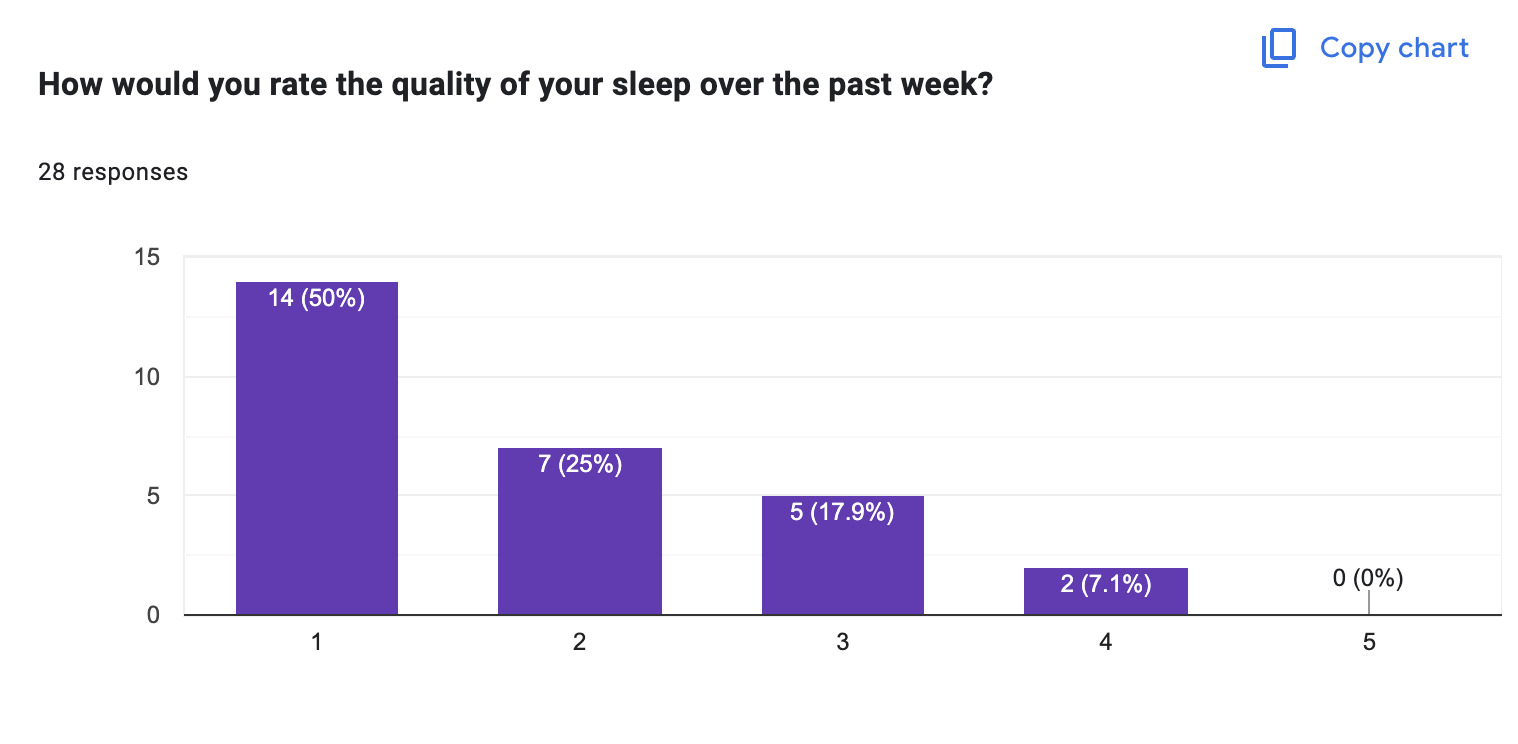
Project 1: Student Well-being Survey Visualization
I designed a survey with 8 questions aimed at capturing the emotional and motivational state of students over recent months. Questions included levels of anxiety, peacefulness, sleep quality, support systems, connection, and even how recently they thought about Turkey’s economy.
The survey results (with 28 students)
Rather than displaying the results with basic charts, I mapped the answers to a modular visual flowchart system, where each response influences elements like color, pattern, shape, and texture. The outcome is a collective landscape of emotional states, a visual diary of the community.
-01.jpg)
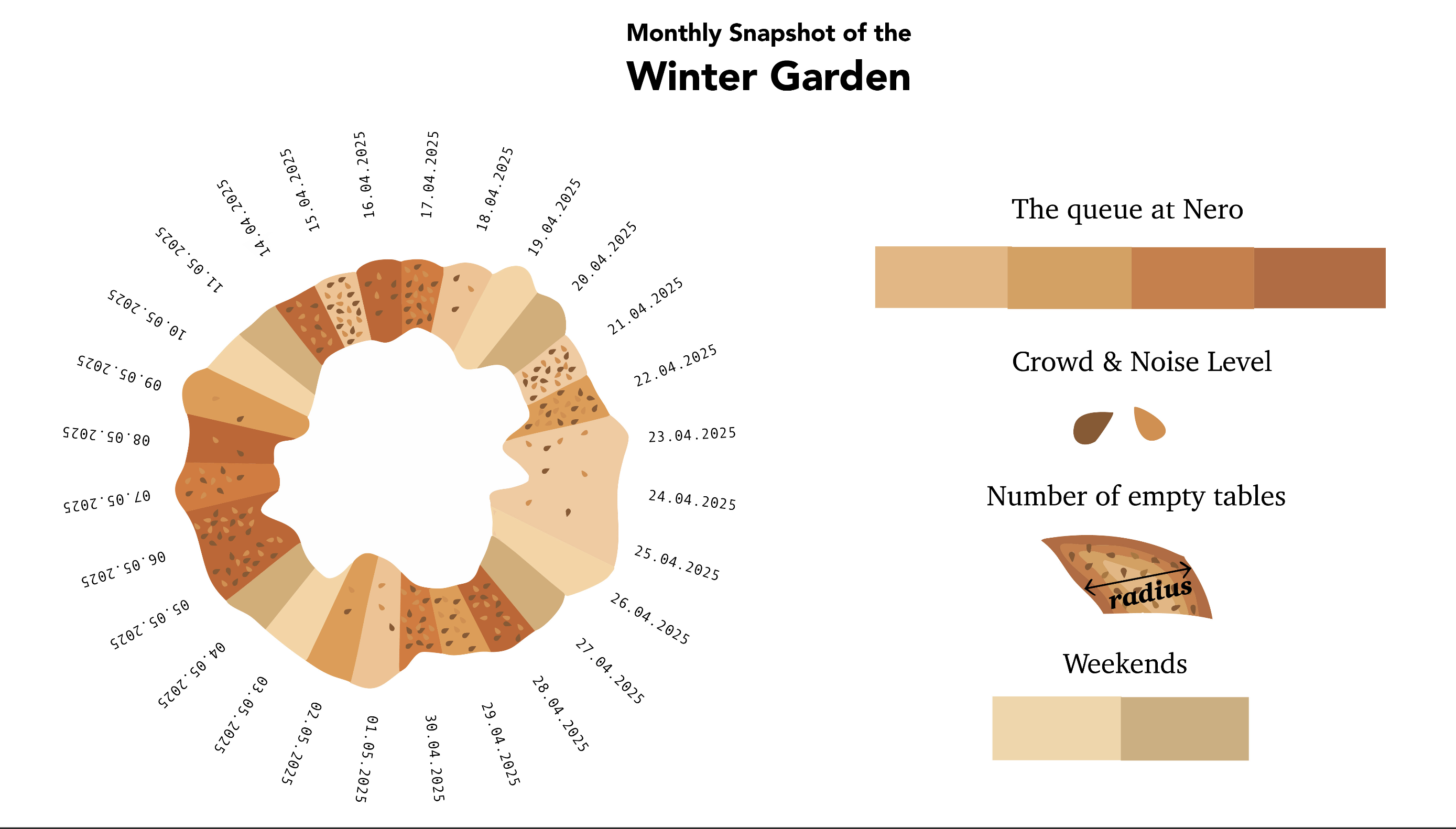
Project 2: A Month in the Winter Garden
The second part of the project involved daily observations of the Winter Garden, a central communal space at our university. Over the course of a month, I recorded:
The queue length at Nero Café General crowd and noise level Number of available tables
I chose to visualize this using a simid (bagel) metaphor—something culturally familiar and symbolic of sharing space. In my design:
The color indicates the length of the queue The width (radius) reflects how many tables were free The sesame pattern communicates the crowd and noise intensity
This transformation turns logistical data into an organic and digestible visual language, inviting viewers to connect with the data through familiarity and metaphor.

The process:
To create a consistent visual language, I segmented the data evenly and mapped each part to a unique color and length based on its label.